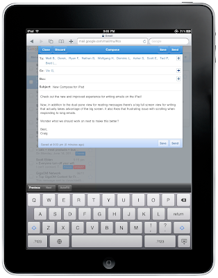
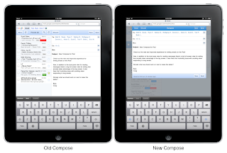
Today we’re happy to announce an improved experience for writing emails on Gmail web interface for iPad. When you write an email you’ll now get a big full screen compose window instead of splitting the screen between your inbox and the compose view. More text is visible at once and there are no more distractions with messages on the side. We’ve also fixed problems that prevented scrolling on long messages. Thanks to everyone who reported the issue via the ‘Send feedback’ feature at the bottom of the screen.

We’re continuing to experiment with the large touchscreen and tablet form factor so send more feedback if you have suggestions. To try out Gmail on the iPad, just go to gmail.com in Safari. Please note that the new interface is only available in US English for now.

Posted by Craig Wilkinson, Software Engineer, Google Mobile